Winning the UK high street isn’t about the loudest colours, but the smartest visual signals that connect with customers on a deeper level.
- Colour psychology must be adapted to the specific British climate and lighting to evoke the right emotions.
- A modern logo must be a flexible system, designed for coherence from a physical shop fascia to a tiny Instagram avatar.
- A timeless, authentic identity builds far stronger local loyalty than constantly chasing fleeting design trends.
Recommendation: Audit your current visual identity not for what looks ‘nice’, but for its behavioural legibility, emotional resonance, and cross-platform cohesion.
For any small business owner, the UK high street is a battlefield of attention. From cafes to boutiques, everyone is vying for the same fleeting glance from a potential customer. The common advice is to “get a good logo” or “be consistent,” but this often leads to generic visuals that blend into the noise. This approach misses the fundamental point: your brand’s visual identity isn’t just decoration; it’s a powerful tool for psychological influence and commercial success.
Many SMEs fall into the trap of either following the latest minimalist trend, which can feel cold and impersonal, or sticking with a dated look for fear of alienating regulars. The real challenge lies in creating a visual language that feels both fresh and authentic, modern yet trustworthy. It’s about understanding that the colour of your awning can genuinely make someone feel warmer on a grey November day, and the font on your sign can be the difference between a customer walking in or walking on by.
But what if the key wasn’t simply choosing ‘nice’ colours, but understanding the sensory science behind them? What if your logo’s success depended less on its style and more on its structural adaptability? This guide moves beyond the platitudes to offer a strategic framework. We will explore how to make deliberate visual choices that resonate with the British public, build lasting local loyalty, and translate directly into a stronger bottom line.
We’ll deconstruct the core elements of a successful high street brand, from the science of colour and the mechanics of a versatile logo to the crucial choice between chasing trends and building a timeless identity. This article provides a clear roadmap for turning your visual brand into your most effective sales tool.
Contents: How to Build a Powerful Visual Brand
- Why do warm tones convert better than cool blues in British winter retail?
- Why do greens and blues consistently lower heart rates in gallery settings?
- How to design a logo that works on both a shop fascia and an Instagram avatar?
- The font choice mistake that makes your signage unreadable from a passing bus
- Trend Following vs timeless Identity: which builds stronger local loyalty?
- How to update your visual identity without alienating existing regular customers?
- Agency Polish or Freelance Agility: which suits a startup budget better?
- Graphic Design Rates in London: What is Fair for Freelance Branding Projects?
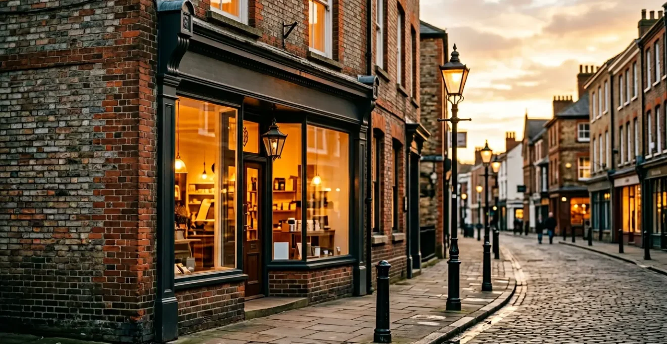
Why do warm tones convert better than cool blues in British winter retail?
On a perpetually grey British afternoon, colour isn’t just an aesthetic choice; it’s an emotional invitation. While cool blues can feel crisp and professional in a corporate context, they can register as cold and uninviting in a retail setting, particularly during the UK’s long autumn and winter months. The human brain is wired to seek out warmth and comfort, and your shopfront’s colour palette is the first signal it receives. Warm tones like terracotta, deep oranges, and rich yellows tap into primal associations with fire, hearth, and shelter, creating an subconscious pull that says “come in, it’s cosy here.”
This isn’t just theory; it’s sensory branding in action. These colours can physically make a space feel warmer and more welcoming, cutting through the visual chill of a damp high street. This psychological warmth translates into tangible business benefits: customers are more likely to linger, feel more positive, and consequently, be more inclined to make a purchase. According to one study, an overwhelming 77% of UK business leaders believe incorporating design trends—and the underlying psychology—into their branding actively enhances company performance.
However, “warm” doesn’t have to mean loud or garish. Sophistication is key to appealing to modern British consumers. Instead of a basic orange, consider a muted terracotta; in place of a primary red, a deep burgundy can signal luxury and warmth simultaneously. Even combining warm white walls with amber-toned accent lighting can create an inviting atmosphere. The goal is to craft a palette that feels like a welcoming embrace, not a desperate shout for attention.
Why do greens and blues consistently lower heart rates in gallery settings?
While warm tones offer an invitation, cool colours like green and blue serve a different, equally powerful purpose: creating an atmosphere of calm and focus. This is rooted in biophilia—our innate human tendency to connect with nature. Blues evoke the sky and sea, while greens signal foliage and life, both of which have a documented soothing effect on the nervous system. In a commercial context, this is a strategic tool for managing customer experience. For businesses where a considered purchase is required, such as a gallery, a high-end jeweller, or a wellness clinic, these colours can be invaluable.
The effect is physiological. Studies on environmental psychology have shown that exposure to these colours can lower blood pressure and heart rate, reducing feelings of anxiety and creating a mental space where customers feel relaxed enough to browse and contemplate. In fact, specific research on workplace colour psychology confirms that blue reduces stress and can even increase productivity in UK office spaces, an effect that translates directly to retail environments where a calm, focused mindset is beneficial.
This principle is expertly demonstrated by brands like The Body Shop, which uses a palette of natural greens to reinforce its message of sustainability and ethical sourcing. Their branding doesn’t just tell you their products are natural; it makes you feel it. The use of green creates a tranquil, reassuring environment that aligns perfectly with their brand values, encouraging customers to trust the products and spend time exploring the range. For a UK SME, using a deep forest green or a muted slate blue could differentiate a brand as a calm oasis on a bustling high street.
How to design a logo that works on both a shop fascia and an Instagram avatar?
In today’s market, your logo lives a double life. It must command attention as a three-dimensional sign on your physical shopfront and, simultaneously, be instantly recognisable as a one-centimetre-square circle on a smartphone screen. This challenge requires a shift in thinking: you’re not designing a single image, but a flexible visual system. The key is to prioritise simplicity, scalability, and a strong, clear silhouette. A logo cluttered with fine details or delicate text will turn into an unreadable smudge when shrunk down for a social media profile.
The first step is to design for the smallest application first. If your logo works as a tiny app icon, it will almost certainly work when scaled up. This means focusing on a bold, unique shape or a monogram that can stand alone without the full company name. This core element, or “logomark,” becomes the anchor of your brand’s cross-platform cohesion. Think of how the Nike “swoosh” or the Apple logo are instantly identifiable without any accompanying text. This is the level of iconic simplicity SMEs should aspire to.
This shows the critical need for a logo that is conceptually strong enough to be adapted across different contexts and materials.
Finally, having the right file formats is non-negotiable for practical application. A designer should provide you with a full suite of files, each with a specific purpose. This technical toolkit is what allows your brand to appear professional and consistent everywhere it’s seen.
| Format | Use Case | Advantages | Limitations |
|---|---|---|---|
| SVG | Shop fascia, web | Infinitely scalable, small file size | Not supported by all printers |
| AI/EPS | Professional printing | Industry standard, editable | Requires Adobe software |
| PNG | Instagram, social media | Transparent background, web-ready | Fixed resolution |
| JPEG | Email, documents | Universal compatibility | No transparency |
The font choice mistake that makes your signage unreadable from a passing bus
Typography is the voice of your brand, and on a busy high street, it needs to speak clearly and quickly. The single biggest mistake SMEs make is choosing a font for its “style” without considering its behavioural legibility—its ability to be read and understood at a distance, in motion, and in a split second. A customer glancing at your shopfront from a passing double-decker bus or across a crowded street has milliseconds to register who you are and what you do. An overly decorative, thin, or tightly-spaced font will fail this critical test every time.
The key factors for high-legibility signage are not aesthetic but functional. Look for fonts with a high “x-height” (where the main body of lowercase letters is tall), open apertures (the gaps in letters like ‘c’ or ‘e’), and generous spacing between characters (known as tracking). These characteristics prevent letters from blurring together at a distance. Clean, modern sans-serif fonts are often the safest bet for primary signage, as their lack of decorative strokes (serifs) enhances clarity.
This shows the sculptural and textural qualities of letterforms, reminding us that typography in the physical world is about form and light, not just abstract shapes on a screen.
While you might use a more characterful “display” font for a menu or an in-store promotion, your main fascia signage must prioritise function over flourish. Below is a list of tried-and-tested fonts renowned for their clarity, making them excellent choices for any UK high street business that wants its message to land, even from the top deck of a bus.
- Montserrat: High x-height, excellent spacing, reads clearly at distance.
- Lato: Humanist qualities maintain warmth while ensuring legibility.
- Public Sans: Government-tested for accessibility, perfect for clear messaging.
- Roboto: Geometric clarity with friendly curves, works at all scales.
- Open Sans: Neutral design with optimal letter spacing for quick reading.
Trend Following vs timeless Identity: which builds stronger local loyalty?
In the world of design, trends come and go with dizzying speed. While it can be tempting for a small business to jump on the latest bandwagon—be it hyper-minimalism or a retro 90s revival—this approach often undermines the single most valuable asset a local business can have: trust. Chasing trends can make a brand feel flighty and inauthentic. A timeless identity, on the other hand, rooted in the business’s core values and story, builds a foundation of stability and reliability that fosters deep, lasting customer loyalty.
A timeless identity doesn’t mean being old-fashioned. It means distilling your brand down to its most essential, enduring qualities. It’s about creating heritage cues, even for a new business, that suggest quality and permanence. This could be a classic serif font, a carefully chosen colour palette that reflects the local environment, or a logomark inspired by a local landmark. These elements create a narrative that customers can connect with on a personal level, making your business feel like an integral part of the community fabric, not just another transient shop.
As 4imprint UK notes in its analysis of branding trends, even established luxury brands are recognising the power of their history:
Burberry’s rebrand saw the return of its iconic serif logo and a richer, more textured visual identity. The brand embraced heritage and warmth while maintaining a clean, sophisticated appeal.
– 4imprint UK, Shaping Success: The Visual Identity Trends in UK Branding
The commercial argument for this approach is compelling. Consistency and authenticity are not just feel-good concepts; they are directly linked to revenue. When customers know what to expect from your brand visually, it builds a sense of security that encourages repeat business. Indeed, research from Adobe has revealed a potential 20% revenue increase for brands with a consistent visual identity, highlighting that stability is not only reassuring but also profitable.
How to update your visual identity without alienating existing regular customers?
For an established SME with a loyal customer base, the thought of a rebrand can be terrifying. The fear is valid: a drastic, poorly communicated change can feel like a betrayal to regulars who have a personal connection to your business’s familiar look and feel. The key to a successful update is not revolution, but evolution. The goal is to refresh and modernise your brand without erasing the visual equity and emotional goodwill you’ve spent years building.
The “80/20 rule” is a safe and effective framework to follow. Aim to retain approximately 80% of your core visual DNA—your primary colour, the basic shape of your logo, or a distinctive typographic style—while updating the remaining 20%. This could mean refining your logo to make it cleaner and more scalable, introducing a secondary accent colour to your palette, or updating your packaging with more modern materials. This approach signals progress and relevance while maintaining a crucial thread of familiarity. It tells your customers, “We’re getting better,” not “We’re becoming someone else.”
Communication is just as important as the design itself. Don’t spring the changes on your customers overnight. Tease the update on social media and in-store a few weeks in advance with messaging like, “A fresh look is coming soon!” or “Getting ready for our next chapter.” This turns the rebrand into a shared event and an opportunity for positive engagement, rather than a jarring shock. When you do launch, explain the “why” behind the changes. Frame it as an investment in a better customer experience, a commitment to sustainability, or a celebration of a new milestone.
Your 5-Point Visual Identity Refresh Checklist
- Points of Contact: List every channel where your brand is seen, from your shop sign and coffee cups to your Instagram profile and email signature.
- Collect & Inventory: Gather examples of all existing visual elements (logo files, colour codes, photos, font files).
- Check for Coherence: Compare your visuals against your core business values. Does your branding look cheap if you sell a premium product? Does it feel corporate if you pride yourself on being personal?
- Assess Emotional Impact: Look at your branding with fresh eyes. Does it feel inviting, energetic, calm, or dated? Identify elements that feel unique versus those that look generic.
- Create an Integration Plan: Prioritise the updates. Start with high-impact, low-cost digital assets first (social media), then plan for physical changes (signage, print) to manage budget and workflow.
Agency Polish or Freelance Agility: which suits a startup budget better?
Once you’ve decided to invest in your visual identity, the next critical question is: who do you hire? The choice between a branding agency and a freelance designer often comes down to a trade-off between budget, process, and scope. A full-service agency offers a comprehensive, team-based approach, often including market research, strategy workshops, and dedicated project management. This “polish” comes at a premium price, making it a better fit for businesses with a significant budget and complex needs.
For most startups and SMEs on the high street, a skilled freelance designer often represents the sweet spot of value and quality. A freelancer offers agility and a direct line of communication. You work one-on-one with the creative mind responsible for your brand, allowing for a more personal, responsive, and often faster process. While they may not offer the broad strategic services of an agency, a seasoned freelancer brings a wealth of experience from working with various clients, providing expert guidance on what works in the real world. This lean approach is typically more budget-friendly.
This image captures the hands-on, creative process that is often more accessible when working directly with a freelance professional.
The cost of branding in the UK varies dramatically based on scope and experience. However, a recent analysis of typical pricing shows a £500-£6,000+ range for UK SME branding projects, with freelance projects generally occupying the lower to mid-end of this spectrum. Platforms like The Dots or even local business networks are excellent places to find vetted freelance talent whose portfolio aligns with your aesthetic and whose rates fit your budget. The key is to review their past work and speak to previous clients to ensure they understand the unique challenges of branding for a physical, customer-facing business.
Key Takeaways
- Your brand’s visual identity is a strategic tool, not just decoration; every choice should be deliberate.
- Adaptability is non-negotiable. Your logo and brand elements must function seamlessly from a large physical sign to a small digital icon.
- Timeless authenticity builds more long-term trust and loyalty with local customers than chasing fleeting design trends.
Graphic Design Rates in London: What is Fair for Freelance Branding Projects?
Determining a fair price for a branding project can feel opaque for many SMEs. Rates in the UK, and especially in London, can vary wildly. Understanding what drives these costs is the key to setting a realistic budget and assessing a designer’s quote. The price is not just for a logo; it’s for the strategy, experience, and process that lead to a successful visual identity. It’s an investment in a critical business asset.
Freelance branding projects are typically priced in one of three ways: by the hour, per project, or based on value. While hourly rates are common, a fixed project fee is often better for SMEs as it provides cost certainty. An experienced designer will usually scope the project based on the required deliverables and the complexity of the work, not just the hours it will take. This is a sign of professionalism. As one UK Design Industry Report notes, “Experienced designers often price based on the value and ROI they bring to the business, not just the hours worked.”
To provide clarity, branding projects can be broken down into tiers. A “logo only” package from a junior designer might be a few hundred pounds, while a comprehensive identity system from a senior designer, including a brand strategy workshop, can run into many thousands. The following table provides a general guide to freelance branding price brackets in the UK, with an acknowledgement that London-based designers often command a 20-30% premium due to higher overheads.
| Service Level | Price Range | Deliverables | Designer Experience |
|---|---|---|---|
| Logo Only | £500-£1,500 | Basic logo, 2-3 concepts | Junior (1-3 years) |
| Logo & Guidelines | £2,000-£5,000 | Logo system, basic brand guide | Mid-weight (3-7 years) |
| Full Identity | £6,000+ | Complete system, strategy included | Senior (7+ years) |
| London Premium | +20-30% | Same as above | Location adjustment |
Your visual brand is your hardest-working employee, communicating with customers 24/7. Investing wisely in its creation and maintenance isn’t a cost—it’s one of the most effective growth strategies available to a high street business. Begin the process of turning your brand into a strategic asset today.
Frequently Asked Questions about Visual Branding for SMEs
How much change is too much for existing customers?
Keep 80% of core visual elements (colors, shapes, fonts) and update only 20% for freshness. This maintains familiarity while showing evolution.
Should we announce the rebrand before or after implementation?
Tease the change 2-3 weeks before with ‘coming soon’ messaging, then celebrate the launch as an event to generate excitement rather than confusion.
What if customers react negatively to initial changes?
Have a feedback mechanism ready and be prepared to adjust minor elements. Most resistance fades within 4-6 weeks as customers adapt to the new look.