Your visceral reaction to colour is not just a matter of taste or cultural conditioning; it’s a hardwired physiological response originating in your neuro-perceptual system.
- Specific colour wavelengths (blue, green) directly signal the brain’s regulatory centres to induce calm, physically lowering heart rate.
- High-contrast colour pairings can cause ‘visual vibration,’ a physical phenomenon rooted in optics that can lead to perceptual stress and even nausea.
- Context, from cultural background to the immediate environment and lighting, can completely invert the emotional response to a single colour.
Recommendation: Artists and designers can move beyond simple symbolism and learn to master these neuro-perceptual triggers to intentionally sculpt a viewer’s psychological and physiological experience.
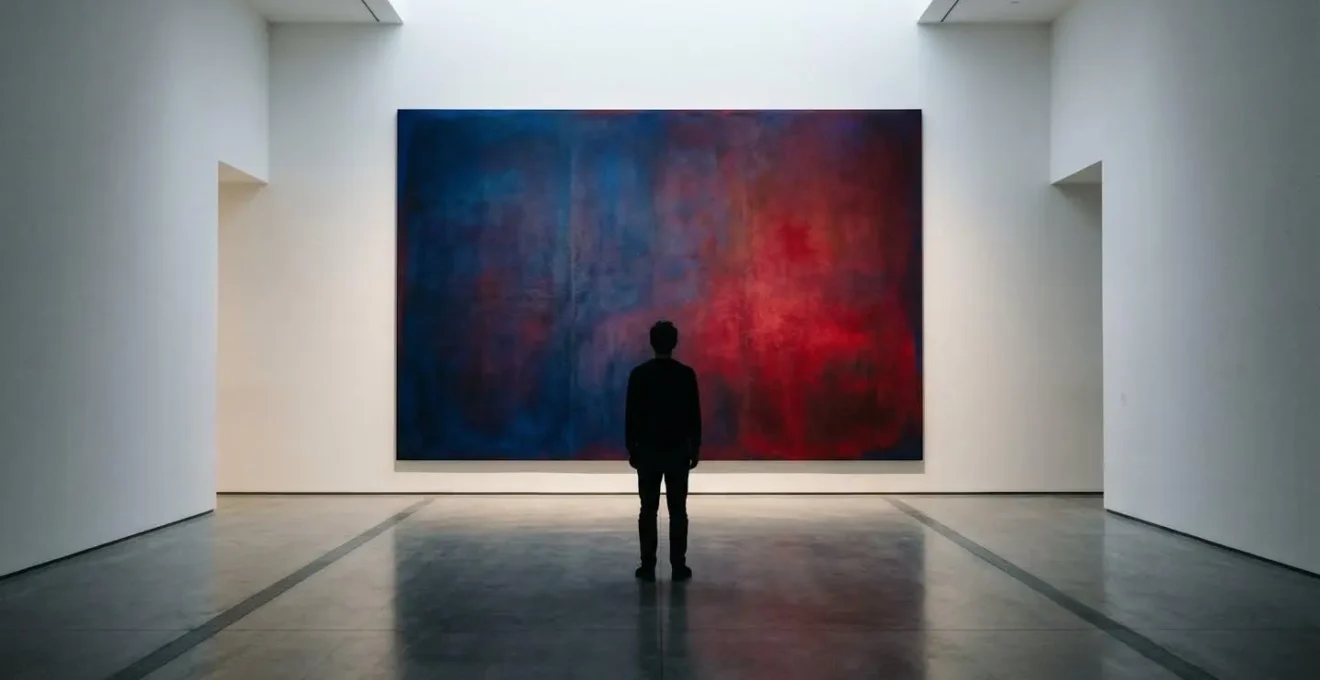
Have you ever walked into a gallery and felt an unexplainable sense of unease from a particular painting? Or felt a wave of calm wash over you in a room, without quite knowing why? This deep, gut-level reaction to our visual environment—a visceral response—is often dismissed as subjective preference or a half-remembered association. We’re told that red is ‘passionate’ because of roses or that green is ‘natural’ because of trees. While these symbolic layers exist, they are only a small part of the story. They fail to explain the immediate, often unconscious physical and emotional shifts that colours can provoke within us, from a racing heart to a subtle feeling of claustrophobia.
The common understanding of colour psychology often remains at this surface level, focusing on learned cultural meanings. But what if the key to understanding these powerful reactions wasn’t in our memory, but in our biology? What if the anxiety triggered by certain hues isn’t an idea, but a direct physiological event hardwired into our brains? This is where we move beyond symbolism and into the realm of neuroaesthetics and perceptual science. The real mechanism is far more intricate, involving the physics of light, the specific cells in our retina, the processing limitations of our brain, and ancient environmental cues our nervous system is built to recognise.
This article dissects these hidden mechanics. We will explore the direct neuro-perceptual pathways that link specific colours to physiological calm and others to cognitive stress. We will analyse how artists can manipulate contrast and light to create physical sensations of compression or expansion, and how context can flip a colour’s meaning entirely. By understanding the ‘why’ behind the visceral response, artists and designers can evolve from being decorators of space to becoming architects of emotion, intentionally guiding the viewer’s inner world.
To fully grasp how these elements orchestrate our emotional experience, this guide breaks down each component, from the cellular level of our eyes to the psychological impact of a room’s design. The following sections will provide a detailed roadmap into the science of visceral reactions to art.
Table of Contents: The Science of Visceral Colour Response
- Why do greens and blues consistently lower heart rates in gallery settings?
- How to use high-contrast colours to make a small room feel claustrophobic?
- Red in UK vs Red in China: how cultural background alters visceral reaction?
- The colour combination mistake that causes ‘visual vibration’ and nausea
- How to adjust Kelvin temperature to intensify the emotional weight of a painting?
- Why do minimalist sculptures often fail in heavily ornamented Victorian rooms?
- Why does viewing fractal patterns reduce cortisol levels in stressed visitors?
- Art to Provoke Introspection: Can Gallery Design Improve Mental Health?
Why do greens and blues consistently lower heart rates in gallery settings?
The calming effect of greens and blues is not merely a poetic association with nature, but a direct neuro-perceptual mechanism. The response is rooted in a specialized, non-image-forming visual pathway that connects our eyes directly to the hypothalamus, the brain’s command centre for stress regulation, hormonal balance, and autonomic functions like heart rate. This biological shortcut means that certain colours can influence our physiology before we even consciously process what we are seeing.
This physiological resonance is demonstrably real. For instance, controlled studies show that exposure to green and blue light produces a statistically significant calming effect. In one key experiment, researchers found that green and blue colours lower heart rate while red increases it, confirming a direct link between colour wavelength and our cardiovascular system. This isn’t a learned behaviour; it’s a fundamental biological reaction.
The science behind this explains the specificity of the effect. As a Professor of Colour Science notes, this occurs because certain retinal cells are uniquely tuned to specific types of light:
retinal cells that form the non-image-forming visual pathway between eye and hypothalamus are selectively sensitive to the short wavelengths (blue and green) of the visible spectrum
– Professor of Colour Science, The Conversation
For an artist or designer, this means that the use of a cool-toned palette is not just setting a ‘mood’—it is actively engaging a viewer’s nervous system to induce a state of physiological calm. The effect is most powerful when these colours are dominant and immersive, allowing this neuro-perceptual mechanism to operate with minimal interference from other stimulating visual information. It is a tool for directly modulating the viewer’s physical state of being.
How to use high-contrast colours to make a small room feel claustrophobic?
While cool colours can calm, high-contrast colour schemes can be weaponized to create a visceral sense of anxiety and spatial compression. The feeling of claustrophobia in a visually busy room is not just an illusion; it is a response to intense cognitive and perceptual load. When a small space is filled with sharply contrasting colours—such as black against white, or complementary hues like vibrant red and cyan—the eye is denied a place to rest. This constant stimulation creates a form of visual ‘noise’.
Our brain interprets this lack of visual respite as a threat or a problem to be solved, keeping the nervous system in a state of high alert. The sharp edges between contrasting colours force the eye to work harder to define boundaries, an effect that is magnified in a confined area. This heightened visual activity in a physically small space makes the room feel smaller and more oppressive than it actually is, triggering a claustrophobic response. The visual world closes in, and our brain responds as if the physical walls are doing the same.
As the image above demonstrates, the very boundary where two highly saturated, contrasting colours meet becomes a point of extreme visual tension. This perceptual compression can be used strategically by an artist to control a viewer’s emotional state. In an installation, for example, using high-contrast, large-scale patterns on the walls of a small room can transform a neutral space into an uncomfortable, anxiety-inducing environment. It’s a way of manipulating the viewer’s sense of safety and comfort by deliberately overloading their perceptual system.
Red in UK vs Red in China: how cultural background alters visceral reaction?
While some colour responses are biologically hardwired, many are profoundly shaped by context—both cultural and situational. A colour does not possess a single, universal meaning; its emotional power is unlocked by the framework of associations the viewer brings with them. The classic example is the colour red: in most Western cultures like the UK, it is a dual-symbol of love and passion, but also of danger, warning, and financial debt. In China, however, red is overwhelmingly positive, symbolizing luck, joy, and prosperity, and is central to celebrations like the Lunar New Year.
However, the influence of context goes even deeper than broad cultural programming. The same person can have completely different visceral reactions to the same colour depending on the immediate situation. This is the core of the “Color-in-Context Theory,” which argues that a colour’s psychological effect is not inherent but is determined by the meaning it activates in a specific scenario. There is no universal response, only a context-dependent one.
For instance, research on Color-in-Context Theory developed by Andrew Elliot reveals that red can trigger feelings of attraction when seen on a potential partner during a date, but can simultaneously trigger anxiety and impair performance when seen on the top of a graded exam paper. In the first context, red activates associations of romance and vitality. In the second, it activates learned associations of failure and correction. The colour is the same, but the activated mental framework completely inverts the physiological response from approach to avoidance.
For an artist, this is a critical lesson. You are not just choosing a colour; you are cueing a set of potential associations. The visceral impact of your work depends on which set of associations you successfully prime. An artwork intended to feel celebratory in one culture could feel alarming in another. More subtly, the very title of an artwork or the curatorial text beside it can provide the context that steers the viewer’s reaction towards a desired emotional outcome.
The colour combination mistake that causes ‘visual vibration’ and nausea
Beyond symbolism and context, some colour combinations can trigger a purely physical, and deeply unpleasant, visceral reaction. This phenomenon, often called ‘visual vibration’ or ‘chromatic stress,’ can cause headaches, eye strain, and even a feeling of nausea. It most commonly occurs when colours of highly saturated, opposing hues (like bright red and blue, or magenta and green) are placed directly adjacent to each other. The effect is not psychological; it is a byproduct of the physics of light and the mechanics of the human eye.
This discomfort is caused by a principle in optics known as chromatic aberration. In simple terms, the lens of the human eye, like any simple lens, is not perfect. It cannot focus all wavelengths (colours) of light onto the same point on the retina. Short-wavelength light (like blue) is bent more sharply and focuses slightly in front of the retina, while long-wavelength light (like red) is bent less and focuses slightly behind it. This is a normal and usually unnoticeable imperfection.
Case Study: Chromatic Aberration as a Source of Motion Sickness in Video Games
The physiological impact of chromatic aberration is so potent that it has become a known issue in the video game industry. To simulate a ‘cinematic’ or ‘imperfect lens’ look, some games intentionally add a digital chromatic aberration effect, which creates colour fringing around objects. However, numerous players have reported that this effect induces severe headaches and motion sickness. On forums, users describe the experience as their “eyes not being able to focus,” leading to immediate relief only after the setting is disabled. This provides a clear, real-world example of how the forced separation of colour wavelengths can create a genuinely nauseating visceral response.
When you place highly saturated red and blue side-by-side, you force the eye to try to do the impossible: focus on two different focal planes simultaneously. The lens rapidly and unconsciously shifts focus back and forth in a futile attempt to get both colours sharp, creating a shimmering or vibrating effect at their border. This constant, high-frequency muscular effort is what leads to strain and discomfort. As detailed in optometry research on chromatic aberration, our lenses simply cannot bring all wavelengths to a single point, causing visible distortions in such high-contrast scenarios. An artist unaware of this principle might create a work that is unintentionally difficult or even physically painful to view.
How to adjust Kelvin temperature to intensify the emotional weight of a painting?
The colour of an object is only half the story; the colour of the light illuminating it is the other. Lighting is not a neutral factor in a gallery setting—it is an active tool for sculpting emotion. By adjusting the colour temperature of a light source, measured in Kelvin (K), a curator or artist can fundamentally alter the psychological atmosphere of a piece and intensify its emotional weight. Colour temperature is what makes light feel ‘warm’ or ‘cool’.
Our response to light temperature is deeply ingrained, tied to ancient environmental cues. As color psychology researchers have noted, our brains are wired to associate different light qualities with specific conditions of survival and social bonding. Low Kelvin temperatures (around 2700K) produce a warm, yellowish-orange light, similar to a flame, a bonfire, or a sunset. This light triggers feelings of safety, community, and intimacy. Conversely, high Kelvin temperatures (5000K and above) produce a cool, bluish-white light that mimics the bright sun of midday or an overcast sky, which can trigger feelings of alertness, clinical precision, or even melancholy.
our brains associate warm light (low Kelvin) with fire and sunset, triggering feelings of safety and community. Cool light (high Kelvin) mimics midday sun or overcast skies, triggering alertness or even melancholy
– Color Psychology Researchers, Analysis of psychological responses to light temperature
Imagine a portrait with subtle tones of sadness. Illuminating it with cool, high-Kelvin light will amplify this feeling, making the scene feel more isolated and stark. The same painting lit with warm, low-Kelvin light might instead take on an air of quiet, nostalgic reflection. The emotional narrative is completely transformed, not by changing the artwork, but by changing the light in which it is viewed.
This makes the lighting designer a co-author of the viewer’s experience. The choice of bulb and its Kelvin rating is as much an artistic decision as the choice of pigment. It is the final layer of colour applied to the work, capable of either reinforcing or contradicting the artist’s original intent.
Why do minimalist sculptures often fail in heavily ornamented Victorian rooms?
The failure of a minimalist sculpture in a Victorian interior is a perfect example of contextual dissonance. It’s not that the sculpture is bad or the room is ugly; it’s that the two visual systems are fundamentally at war. A Victorian room is characterized by high visual complexity: ornate wallpaper, intricate mouldings, detailed furniture, and rich textures. The brain, upon entering such a space, adapts to a high level of incoming information. It expects visual density and rewards for detailed inspection.
A minimalist sculpture, by contrast, is built on the principle of visual reduction. It champions clean lines, simple forms, and a lack of ornamentation. Its power lies in what has been removed, forcing the viewer to contemplate pure form, material, and the space around the object. It operates in a low-information visual field, where every subtle curve and texture is significant precisely because there is nothing else to look at.
Placing this object of “visual quiet” into an environment of “visual noise” creates a perceptual conflict. The brain, already primed by the room for high complexity, struggles to process the sculpture. The sculpture’s intended subtlety is completely drowned out by the surrounding ornamentation. It doesn’t appear serene or profound; it appears empty, unfinished, or simply out of place. The visual language of the artwork is rendered meaningless because the environmental context speaks a different, much louder language. It is the artistic equivalent of trying to whisper a secret during a rock concert.
This principle of contextual harmony is crucial. For an artwork to deliver its intended visceral impact, its own visual complexity must be in a supportive relationship with the complexity of its environment. A minimalist piece thrives in a minimalist gallery—a “white cube”—because the neutral environment allows its subtle qualities to become the focus of attention. In this case, the context amplifies the artwork’s message rather than smothering it.
Key Takeaways
- Colours are not just symbolic; specific wavelengths trigger direct physiological responses like changes in heart rate via a hardwired neuro-perceptual pathway.
- The emotional impact of a colour is highly dependent on context, including cultural background, situational cues, and the temperature of the light illuminating it.
- Technical aspects of vision, such as chromatic aberration, mean that certain high-contrast colour pairings can create physical discomfort, eye strain, and even nausea.
Why does viewing fractal patterns reduce cortisol levels in stressed visitors?
Just as some visual inputs can create stress, others are uniquely equipped to relieve it. Among the most powerful are fractal patterns—the complex, self-repeating shapes found everywhere in nature, from ferns and snowflakes to coastlines and clouds. Our profound and positive visceral response to these patterns is a phenomenon known as “fractal fluency,” and it has a direct, measurable effect on our stress levels.
The calming effect stems from how our visual system evolved. For millennia, our survival depended on understanding and navigating natural environments rich in fractal geometry. As a result, our brain developed a highly efficient method for processing these specific patterns. Viewing them is effortless and feels inherently pleasant because we are literally built for it. This ease of processing has a direct physiological payoff: it reduces stress and induces a state of relaxed wakefulness. For example, research by physicist Richard Taylor’s team found that participants recovered 60% better from stress when viewing fractal images compared to simple geometric shapes.
This isn’t just a subjective feeling of relaxation; it’s a quantifiable change in brain activity. Further studies using electroencephalogram (EEG) data demonstrates that our frontal lobes produce alpha brainwaves—a state associated with being awake but relaxed and ready—when we view these patterns. However, not all fractals are created equal. The stress-reducing effect is highly dependent on the pattern’s complexity, a value known as its fractal dimension (D).
stress reduction is dependent on the fractal dimension (D). Patterns that are too simple (D ≈ 1) are boring, while those that are too complex (D ≈ 2) are chaotic and stressful. The calming sweet spot (D ≈ 1.3-1.5) mirrors the complexity of natural scenery
– Fractal psychology researchers, Fractal Patterns in Architecture: Design That Heals
Artists like Jackson Pollock intuitively capitalized on this, creating paintings with a fractal dimension that falls directly within this calming “sweet spot.” By incorporating these naturally pleasing patterns, an artist can create work that doesn’t just represent nature, but actively mimics its stress-reducing properties, offering the viewer a moment of genuine physiological respite.
Art to Provoke Introspection: Can Gallery Design Improve Mental Health?
The principles of visceral response extend beyond the canvas and into the very architecture of the space where art is viewed. A gallery or museum is not a neutral container; it is an active environment that can either heighten anxiety or foster a state of calm introspection conducive to improving mental health. By applying the lessons of environmental psychology, these spaces can be intentionally designed as places of healing and restoration.
The factors that contribute to stress in any environment are well-documented. As a comprehensive review of 140 years of modern architecture and environmental psychology studies identified that aggression is linked to factors like crowding, excessive noise, a lack of privacy, and an absence of “positive distractions” like views of nature. A poorly designed gallery—overcrowded, with poor acoustics, confusing layouts, and harsh lighting—can inadvertently trigger the exact same stress responses, preventing visitors from engaging deeply with the art.
Conversely, a space designed with intention can do the opposite. It can become a sanctuary. This approach, known as evidence-based design, uses architectural choices to actively support psychological well-being. This involves more than just hanging art on white walls; it means choreographing the visitor’s entire sensory experience.
Case Study: The Centre for Addiction and Mental Health (CAMH) in Toronto
The design of the CAMH campus is a leading example of a healing environment. By deliberately moving away from a traditional, institutional feel, the architects integrated abundant natural light, accessible green spaces, natural materials, and open, easy-to-navigate layouts. The buildings are designed to feel welcoming and integrated with the community, reducing the stigma and anxiety often associated with mental health facilities. This project demonstrates how intentional architectural planning—controlling light, space, and connection to nature—can directly support emotional and psychological health.
Applying this to a gallery setting means creating spaces with clear sightlines, providing quiet nooks for contemplation, using materials that absorb sound, modulating light levels to match the art’s emotional tone, and incorporating biophilic elements like fractal patterns or views of nature. By managing these environmental triggers, a gallery can lower a visitor’s cortisol levels and shift their brain into the relaxed, alpha-wave state needed for true introspection and connection.
Action Plan: Auditing the Visceral Impact of Your Artwork or Exhibition
- Light & Colour Audit: How does the Kelvin temperature of the lighting affect the colours in your work? Test under both warm (2700K) and cool (5000K) light to see how the emotional narrative changes.
- Contrast & Vibration Check: Identify areas with high-contrast, saturated, adjacent colours. View them from a distance. Do they create a ‘vibrating’ or uncomfortable effect? Consider adding a thin neutral border to mitigate chromatic stress.
- Contextual Harmony Analysis: Evaluate the visual complexity of your artwork against its intended environment. Is a minimalist piece being shown in a visually “noisy” space? Is a complex piece lost in an overly simple one?
- Fractal & Pattern Assessment: Does your work incorporate patterns? Are they overly simple (boring), overly complex (chaotic), or do they fall into the pleasing complexity of natural fractals (D ≈ 1.3-1.5)?
- Environmental Scan: Consider the viewing space itself. Is there crowding? Poor acoustics? Is there a place for quiet contemplation? Assess how the environment supports or detracts from the desired visceral response.
The role of the artist and curator thus expands. They are not just presenting objects, but are crafting a holistic psychological journey for the viewer. By understanding and controlling the neuro-perceptual levers of colour, light, and space, they can create environments that don’t just show art, but actively improve the mental well-being of those who experience it.
Ultimately, by mastering these visceral triggers, you move beyond merely showing what an emotion looks like and begin to directly evoke what it feels like in the viewer’s own nervous system. Start today by looking at your own work not just as a composition of forms and hues, but as a powerful tool for sculpting the physiological and psychological experience of your audience.