The key to integrating art in Georgian homes isn’t about following rules, but about mediating a visual dialogue between the architecture and the artwork.
- The ornate language of Georgian design, present in features like elaborate plasterwork, can conflict with modern minimalism if not translated correctly.
- Framing, lighting, and placement are your tools for this aesthetic translation, not just for decoration.
Recommendation: Treat each choice as a deliberate act of mediation to either harmonize with the home’s historic character or create intentional, meaningful contrast.
For the owner of a Georgian property, introducing contemporary art is an exercise in exquisite tension. You possess a home defined by principles of symmetry, light, and classical proportion, yet your artistic taste may lean towards the modern, the abstract, or the provocative. The common advice—to simply “mix old and new”—is a platitude that dangerously oversimplifies this challenge. It ignores the very real risk of creating a space where the art and architecture are not in conversation, but in a silent, discordant argument. This can lead to costly mistakes where a minimalist sculpture feels lost and insignificant, or a vibrant canvas feels jarring against delicate cornicing.
The solution is not found in rigid decorative rules, but in a more profound understanding of visual language. If the architecture of your Georgian home speaks a language of refined, historical ornament, and your modern art speaks one of bold, contemporary expression, then your role is not that of a decorator, but of a skilled translator. But what if the true key to success was not in forcing one to submit to the other, but in mastering the art of aesthetic mediation? This approach moves beyond simple colour matching or scale and delves into the nuanced interplay of light, framing, and context.
This guide is built on that principle. We will deconstruct the specific challenges posed by Georgian interiors, from their physical structure to their psychological impact. We will explore how to manage the powerful visual language of period features, how to use technical solutions like lighting and framing to bridge the aesthetic gap, and how to understand the visceral power of colour to create spaces that are not just decorated, but curated with intelligence and soul. This is how you create a home where history and modernity engage in a captivating dialogue, rather than a standoff.
To navigate this sophisticated process, this article breaks down the core challenges and solutions. The following sections will guide you through the practical and aesthetic considerations, from the structural integrity of your ceilings to the psychological impact of your colour choices.
Contents: A Curated Guide to Art in Georgian Homes
- Why do minimalist sculptures often fail in heavily ornamented Victorian rooms?
- How to install track lighting on lath and plaster ceilings without cracking them?
- Gilded Frame or Floating Mount: which bridges the gap between old and new?
- The fireplace mistake that ruins canvas tension and cracks paint
- How to arrange a salon wall to increase the perceived height of a room?
- Why do warm tones convert better than cool blues in British winter retail?
- How to use high-contrast colours to make a small room feel claustrophobic?
- Understanding Visceral Responses: Why Do Certain Colours Trigger Anxiety in Viewers?
Why do minimalist sculptures often fail in heavily ornamented Victorian rooms?
The failure of minimalist art in a richly decorated period setting is not a fault of the art or the room, but a breakdown in visual communication. A Georgian or Victorian interior speaks a language of complexity, detail, and historical reference. Its vocabulary is one of intricate cornicing, deep skirting boards, and elaborate ceiling roses. In fact, research on Georgian architectural features shows that over 60% of these homes feature ornate plasterwork and powerful symmetrical designs. This architectural language is dense and commanding.
When you introduce a minimalist sculpture—a piece whose entire philosophy is based on the reduction of form and the quiet contemplation of space—you are asking it to compete in an environment that is already visually saturated. The sculpture’s quiet, subtle statement is drowned out by the room’s eloquent, historical prose. Rather than creating a point of calm, it often appears diminished, an afterthought lost in the grandeur. The visual weight of the room’s ornamentation simply overpowers the deliberate lightness of the minimalist form.
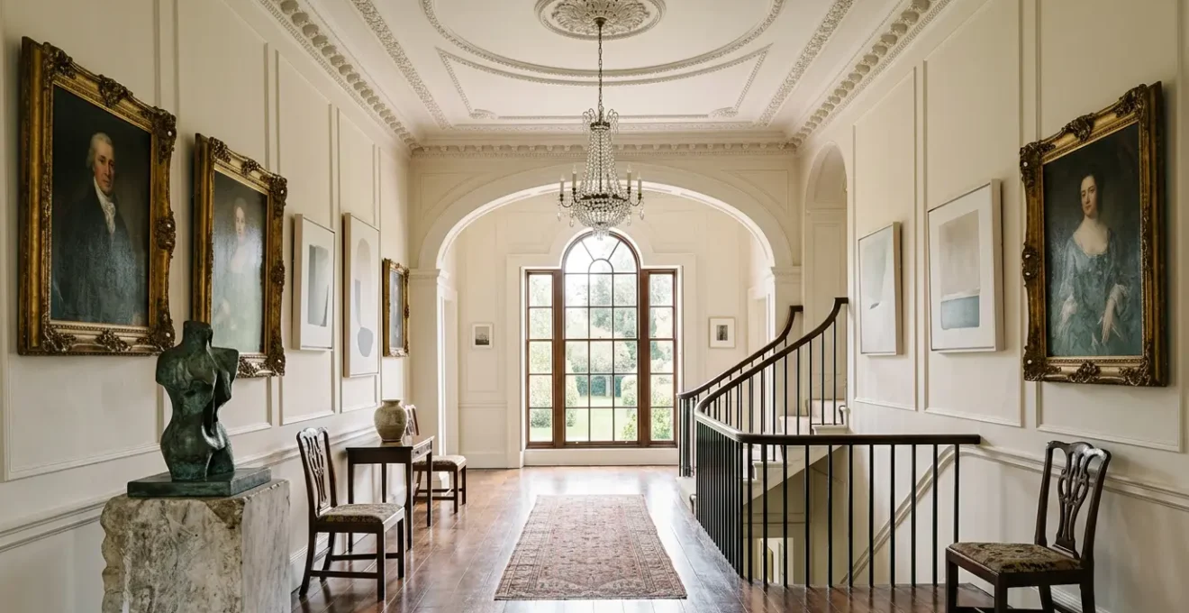
The key is to understand that you are not simply placing an object in a room; you are initiating a visual dialogue. For minimalism to succeed, it requires a neutral backdrop, a “white space” that allows its subtle form to be the primary focus. In a heavily ornamented room, that white space doesn’t exist. The solution is not to abandon minimalism, but to choose pieces with enough scale or material presence (like a polished bronze or a dark stone) to hold their own, or to display them in less-ornamented transitional spaces like hallways, where the architectural language is simpler.
How to install track lighting on lath and plaster ceilings without cracking them?
Illuminating art in a Georgian home is not just an aesthetic choice; it’s a structural intervention. The lath and plaster ceilings, integral to the character of these properties, are notoriously fragile. A poorly planned installation can lead to catastrophic cracking, turning a design upgrade into a costly restoration project. The traditional method of drilling and hoping for the best is simply not an option. The goal is to introduce modern lighting technology while respecting the historic fabric of the building.
The very construction of these ceilings—thin wooden strips (lath) covered in layers of brittle plaster—makes them highly susceptible to vibration and point-load stress. This is what you are working against. The key is to distribute weight and minimise vibration at every step. Before any drilling occurs, locating the ceiling joists is paramount. These wooden beams are the only secure anchoring points. Using modern magnetic stud finders avoids the archaic and damaging practice of drilling exploratory holes. Once the joists are mapped, the selection of the lighting system itself becomes critical. Lightweight tracks with multiple mounting points are preferable to heavy, single-point fixtures, as they spread the load across a wider area, reducing stress on any single point of the delicate plaster.
In some cases, the most respectful solution is to avoid ceiling contact altogether. Tension-mounted systems that run from floor to ceiling offer a brilliant workaround, providing a secure structure for lights without a single screw entering the plaster. If direct mounting is unavoidable, a meticulous approach to drilling and fastening is essential. This is not a task for a standard power drill on high speed; it requires precision and care to preserve the very details you wish to illuminate.
Action Plan: Installing Lighting on Historic Ceilings
- Points of contact: Use magnetic stud finders to locate ceiling joists, the only safe anchoring points, without penetrating the plaster surface.
- Collecte: Select ultra-lightweight track systems with multiple mounting points to distribute weight evenly across several joists.
- Cohérence: Consider tension-mounted floor-to-ceiling systems as a non-invasive alternative that bypasses ceiling contact entirely.
- Mémorabilité/émotion: Pre-drill pilot holes with sharp carbide bits at a very low speed to minimise vibration and prevent plaster from cracking.
- Plan d’intégration: Install vibration-dampening rubber or neoprene washers between the mounting brackets and the ceiling surface to absorb micro-vibrations.
Gilded Frame or Floating Mount: which bridges the gap between old and new?
The frame is the most critical element in mediating the dialogue between a contemporary artwork and a Georgian interior. It is not merely a border; it is a translator, an ambassador that helps two different visual languages find common ground. The choice between a traditional gilded frame and a modern floating mount is a choice between two distinct strategies of aesthetic mediation: elevation or assertion.
A heavy, ornate gilded frame performs an act of ‘elevation’. It takes a modern, perhaps challenging, piece of art and cloaks it in a language the historical room understands. It says, “This new piece is worthy of the same respect as the portraits that once hung here.” This approach is particularly effective for adding gravitas to abstract or conceptual art in formal spaces like a drawing or dining room. The warmth of the gold leaf can also pick up on other metallic details in the room, such as in mirrors or chandeliers, creating a cohesive material palette.
Case Study: Heckfield Place
The Georgian mansion hotel Heckfield Place provides a masterclass in this dual approach. In its formal dining rooms, contemporary artworks are presented in traditional gilded frames, lending them a sense of permanence and dialogue with the grand architecture. Conversely, in transitional spaces like hallways, minimalist pieces are given modern floating mounts. This demonstrates a sophisticated understanding that the framing strategy must adapt to the specific context of each space within the property, mediating the conversation between old and new with precision.
Conversely, a floating mount is an act of ‘assertion’. It makes no apologies for the artwork’s modernity. The shadow gap it creates clearly separates the art from the wall, respecting the integrity of both. This technique allows the art to be a crisp, contemporary statement against the backdrop of historical plasterwork. It works best with minimalist art where the edges of the canvas or paper are part of the composition. This deliberate separation prevents visual confusion and allows both the art and the wall texture to be appreciated independently. The final choice depends on your intention: do you want the art to join the historical conversation or to start a new one?
The following table provides a clear comparison of how different framing choices impact the visual dialogue within a Georgian setting.
| Framing Style | Visual Impact | Best For | Considerations |
|---|---|---|---|
| Gilded Frame | Elevates modern art to historical status | Contemporary pieces in formal rooms | Creates visual weight, adds warmth |
| Floating Mount | Asserts modernity while respecting heritage | Minimalist art in traditional settings | Creates shadow gaps, emphasizes separation |
| Lacquered Color Frame | Acts as deliberate bridge between eras | Transitional spaces | Bold choice requiring color coordination |
The fireplace mistake that ruins canvas tension and cracks paint
Hanging a treasured painting over a mantelpiece is a classic, almost instinctual, design choice. In a Georgian room, with its grand fireplaces, the temptation is even stronger. However, this is often the single most destructive mistake an art owner can make. The issue is not just soot or smoke, but a far more insidious enemy: heat. An active fireplace creates a “thermal envelope” of intense, fluctuating heat and dryness that is catastrophic for most artworks, particularly oil or acrylic on canvas.
The cycle of heating and cooling is the primary culprit. When the fire is lit, the air above the mantelpiece becomes extremely hot and dry. The canvas, made of natural fibres, shrinks. The paint layers, which have different expansion and contraction rates, become brittle. When the fire goes out and the area cools, moisture returns to the air, and the canvas relaxes. This constant cycle of expansion and contraction, known as thermal cycling, puts immense stress on the painting’s structure. Over time, this leads to a loss of canvas tension (sagging) and, most tragically, a network of fine cracks (craquelure) appearing across the paint surface, followed by flaking and paint loss.
Professional conservation bodies are unequivocal about this danger. For instance, conservation guidelines from the National Trust indicate that a minimum 4-foot distance should be maintained from active wood-burning fireplaces. This isn’t an aesthetic suggestion; it’s a technical requirement for preservation. Even with gas or electric fires, which produce less intense heat, a significant clearance is necessary. Ignoring these physical realities for the sake of a traditional aesthetic is a direct path to irreversibly damaging your collection. The fireplace can be the focal point, but the space directly above its heat plume must be considered a no-go zone for valuable art.
How to arrange a salon wall to increase the perceived height of a room?
The salon wall, or gallery wall, is a perfect way to display a diverse collection of art in a Georgian home. However, its arrangement can either enhance or fight against the room’s elegant proportions. A common mistake is a sprawling, horizontal arrangement that can inadvertently make a room with already generous ceilings feel lower. The secret to using a salon wall to increase the perceived height of a room lies in creating a strong, deliberate vertical emphasis.
The human eye is naturally drawn to follow lines. By consciously creating a vertical axis in your arrangement, you encourage the viewer’s gaze to travel upwards, from the skirting board towards the cornice, making the wall feel taller. This is achieved not by chance, but by a series of strategic decisions. The first step is to establish an invisible central line on the wall. Instead of arranging frames randomly, the centres of the most prominent pieces should align along this vertical spine. This creates a subconscious sense of order and upward momentum.
Further enhancing this illusion involves playing with perspective and visual weight. Using progressively smaller frames as you move up the wall mimics natural perspective, making the ceiling seem further away. Similarly, keeping the frame profiles slim and consistent, perhaps in a light colour or a thin metallic finish, prevents the arrangement from feeling heavy and visually “pulling down” the wall. The final, crucial touch is negative space. Leaving more empty wall space on the horizontal plane than on the vertical one forces the composition into a taller, more elegant shape. The highest piece should be hung with a generous gap below the ceiling, not pushed right up against it, to give the eye a final destination and complete the upward journey.
- Create a strong vertical axis by aligning the centres of your main artworks along an imaginary vertical line.
- Use progressively smaller frames as you move up the wall to create a forced perspective illusion of height.
- Choose slim, consistent frame profiles in light colours to minimise the visual weight of the arrangement.
- Leave more negative space between artworks horizontally than you do vertically to encourage an upward reading of the collection.
- Install the highest piece with at least 8-12 inches of clearance from the ceiling to draw the eye fully up the wall.
Why do warm tones convert better than cool blues in British winter retail?
While the title references retail, the underlying principle is deeply relevant to creating inviting residential interiors, particularly in the context of a British winter. The question reveals a fundamental truth of colour psychology: colour is not just a visual experience; it is a psychological one. In a climate known for its grey, overcast skies and limited natural light for several months of the year, warm tones provide a form of psychological compensation.
Warm colours—reds, oranges, yellows, and earthy tones like terracotta and ochre—are associated with energy, heat, and comfort. They are active, advancing colours that can make a space feel cosier and more intimate. Cool colours like blues and greys, while often calming and sophisticated, are passive and receding. In a room with cool, northern light, a blue-grey wall can feel sterile, cold, and even melancholic. A warm-toned wall, by contrast, can simulate the feeling of sunlight, creating a welcoming, cheerful refuge from the weather outside. This isn’t just a matter of taste; it’s a visceral human response to environment.
This understanding is not new; it is reflected in the historical evolution of Georgian interiors themselves. As Sarah Latham, Creative Director of Etons of Bath, notes, while early to mid-18th-century rooms often used deep primary shades, the later Regency era saw a shift. An analysis by the heritage paint company Mylands reinforces this, showing how modern Georgian renovations that use warm heritage shades like ‘Kensington Rose’ create more inviting spaces during winter compared to cooler palettes. This is the principle in action: using colour to provide the psychological warmth that the environment lacks. For a Georgian home in the UK, choosing a colour palette is an opportunity to work with, or against, the climate. Opting for warmth is often a vote for comfort and conviviality.
How to use high-contrast colours to make a small room feel claustrophobic?
This question, though framed negatively, provides a powerful lesson in what to avoid. Understanding how to create a claustrophobic space through colour is the best way to learn how to achieve the opposite. High-contrast colour combinations create a state of high visual energy. When this energy has nowhere to go, as in a small room, it turns into visual noise, which the brain interprets as clutter and confinement.
The primary mechanism at play is visual vibration. When two colours of high contrast and similar saturation (like electric red and kelly green) are placed next to each other, the boundary between them appears to shimmer or vibrate. In a small space, this effect is amplified, creating a sense of instability and preventing the eye from resting. The walls appear to advance on the viewer, physically contracting the perceived space. The Georgian preference for low-contrast schemes of muted pastels and creams was not just an aesthetic choice; it was an intuitive understanding of how to create a sense of calm, airy expansion.
Another method is to use high-contrast patterns. Bold checkerboards, chevrons, or wide stripes in competing colours fragment the room’s surfaces. Instead of seeing continuous, space-defining planes, the eye is confronted with a fractured, chaotic field. This makes it impossible for the brain to accurately gauge the room’s dimensions, leading to a feeling of disorientation and being hemmed in. Finally, a clash of complementary colours, such as a large-scale purple and yellow scheme, can create cognitive overload. The brain struggles to process the competing wavelengths of light, making the boundaries of the room feel unstable and contributing to a sense of unease and claustrophobia.
The table below, based on an analysis of historical design principles, breaks down these effects.
| Contrast Level | Color Combination | Spatial Effect | Psychological Impact |
|---|---|---|---|
| Extreme High | Electric red + Kelly green | Walls visually advance, space contracts | Visual vibration creates anxiety |
| High Pattern | Bold checkerboard/chevrons | Fragments spatial field | Prevents eye from resting |
| Complementary Clash | Purple + Yellow in equal amounts | Boundaries become unstable | Creates cognitive overload |
Key Takeaways
- Dialogue, Not Decoration: Treat art integration as a conversation between the piece and the room’s architecture.
- Mediation is Key: Use framing, lighting, and placement as deliberate tools to bridge the gap between historical and contemporary aesthetics.
- Respect the Physics: Understand and mitigate the physical impact of heat, light, and installation on both the artwork and the historic fabric of the home.
Understanding Visceral Responses: Why Do Certain Colours Trigger Anxiety in Viewers?
The anxiety or unease triggered by certain visual combinations is not a sign of subjective dislike, but a genuine neuroaesthetic response. The brain is a pattern-seeking machine, and when it is presented with conflicting or overly complex information, it can lead to a state of cognitive dissonance that we experience as anxiety. This is particularly true when two distinct and complex “visual languages” are forced to occupy the same space without a clear hierarchy or mediating elements.
Consider the difference between Georgian and Victorian interiors. A historical analysis of period interiors reveals that Victorian design used 40% more saturated colours and significantly more complex patterns than its Georgian predecessors. While a Georgian room might use a simple, low-contrast damask, a Victorian room could layer a floral wallpaper, a patterned carpet, and heavily carved furniture. When you add a piece of complex contemporary art to this already-dense Victorian environment, you are asking the brain to process too much information simultaneously.
This principle of cognitive overload is the root cause of the viewer’s anxiety. It’s a battle for attention with no clear winner. This is why the calmer, more restrained palette of the Georgian era often provides a more successful backdrop for art. It provides a simple, coherent “ground” against which the “figure” of the artwork can stand out. As one design analysis on the subject eloquently puts it:
The brain struggles to process two competing, high-complexity visual languages… leading to a feeling of discord rather than intentional contrast
– Design analysis, Contemporary interpretation of neuroaesthetic principles in historic interiors
Ultimately, a successful interior is one that manages the viewer’s cognitive load. It guides the eye, creates moments of focus and moments of rest. Anxiety is triggered when this balance is lost, and the space becomes a field of visual competition rather than a curated composition. This understanding shifts the designer’s role from one of mere adornment to a manager of perception and psychological comfort.
Begin today by re-evaluating a single piece in your collection, not as a mere object, but as an active participant in your home’s ongoing aesthetic dialogue.
Frequently Asked Questions on Art and Fireplaces
What is the safe distance for hanging oil paintings above a working fireplace?
For traditional wood-burning fireplaces, a strict minimum of 4 feet horizontally and 3 feet vertically is essential to avoid heat damage. Gas fireplaces, which have more controlled heat output, require at least 2-3 feet of clearance. Modern electric units are the safest, typically needing only 1 foot of clearance, but it is always best to check the manufacturer’s specifications.
How does heat affect different art media differently?
The impact of heat varies significantly by medium. Oil paintings are susceptible to cracking and flaking of the paint layers due to the canvas expanding and contracting. Works on paper, such as watercolours or prints, suffer from accelerated acidification, leading to yellowing and brittleness. Photographs are at risk of delamination, where the image layer separates from its backing, and even metal sculptures can experience altered patinas from prolonged exposure to thermal cycling.
Can I use a heat shield to protect artwork near a fireplace?
Yes, physical barriers can offer some protection. A well-placed mantelpiece can deflect some convection heat, and specialised glass heat shields or acrylic barriers can further reduce this. However, they do not eliminate the effects of radiant heat, which travels in a straight line from the fire. For comprehensive protection, professional conservation framing that incorporates UV-protective, heat-resistant glass is a valuable, though not foolproof, additional layer of defence.