Increasing visitor dwell time is not about adding more exhibits, but about mastering the invisible architecture of the visitor’s journey.
- Combat ‘cognitive load’ and decision fatigue with strategic pacing and low-stimulus ‘palate cleanser’ zones.
- Use theatrical lighting and ‘pressure and release’ layouts to guide flow subconsciously, reducing reliance on signage.
- Design for sensory accessibility from the start; creating a predictable, comfortable environment improves the experience for everyone.
Recommendation: Shift your focus from ‘what’ visitors see to ‘how’ they feel and move within the space. Start by conducting a sensory audit of your current exhibition flow.
As a museum curator or exhibition designer, your greatest challenge is capturing and holding attention. You’ve meticulously crafted a narrative, yet you observe visitors accelerating through the final galleries, their engagement visibly waning. The common response is to add more interactive screens or denser text panels, hoping to force engagement. This approach, however, often backfires, contributing to the very problem it aims to solve: cognitive overload.
The solution isn’t to add more, but to design smarter. The most successful exhibitions are masters of spatial psychology. They understand that a visitor’s journey is not just intellectual, but physical and emotional. It’s a carefully choreographed dance between stimulation and rest, curiosity and comfort, guided by subtle environmental cues rather than overt instructions. This is the shift from pure content curation to holistic experience design.
What if the key to increasing dwell time wasn’t in the objects themselves, but in the spaces between them? This guide moves beyond conventional advice to explore the architectural and sensory strategies that shape visitor behaviour. We will delve into how lighting can create an intuitive path, how seating becomes a strategic tool, and why designing for neurodivergent audiences ultimately benefits every single visitor. By mastering these principles, you can transform a passive walk-through into an immersive, memorable experience that naturally encourages visitors to stay longer and connect more deeply.
This article provides a framework for rethinking visitor flow from the ground up. We will break down the common pitfalls in exhibition layout and offer concrete, actionable strategies to sculpt a more engaging and retentive visitor journey.
Summary: Designing the Immersive Museum Journey
- Why do visitors rush through the final third of your exhibition?
- How to use subtle lighting cues to guide visitors without aggressive signage?
- Families vs Solo Scholars: who needs more seating in gallery spaces?
- The layout mistake that creates frustrating queues at star exhibits
- How to position the retail space to capture the ‘exit high’ without feeling predatory?
- Why are photos of mundane high streets becoming valuable historical records?
- Why do visitors with autism need to know where the hand dryers are?
- Visiting Museums: Making Exhibitions Accessible for Neurodivergent Audiences?
Why Do Visitors Rush Through the Final Third of Your Exhibition?
The phenomenon is known as “exit-gradient behaviour” or, more commonly, museum fatigue. It’s a direct result of accumulated cognitive load. Every decision a visitor makes—what to look at, which text to read, where to go next—depletes their mental energy. By the time they reach the final third of your exhibition, their capacity for deep engagement is exhausted. They are no longer absorbing information; they are scanning for the exit. This is a critical issue when findings from the National Museum of African American History and Culture suggest the normal dwell time for most museums is an hour 45 minutes to two hours; fatigue can cut this short significantly.
The mistake is assuming constant stimulation equals constant engagement. The opposite is often true. A relentless pace of high-information displays, without moments of rest, guarantees burnout. To combat this, you must design for pacing and cognitive recovery. The goal is to manage the visitor’s energy as carefully as you manage their path through the space. This involves creating a varied rhythm that alternates between intense, information-rich zones and restorative, low-stimulus areas.
Instead of a marathon, think of your exhibition as a series of sprints with built-in recovery periods. These “cognitive palate cleansers” can be as simple as a dimly lit corridor with a single, stunning visual, a seating area with a view outside, or a gallery dedicated to passive visual appreciation rather than active reading. By strategically placing these moments of respite, especially before the final section, you replenish the visitor’s mental stamina, ensuring they arrive at your concluding exhibits with the energy and curiosity to fully appreciate them. The key strategies include:
- Dynamic Pacing: Intentionally shift the required engagement from active (reading detailed labels) to passive (viewing large-scale visuals).
- Cognitive Palate Cleansers: Design low-stimulus, restorative zones that allow for mental rest before the final exhibition sections.
- Narrative Anticipation: Build the story towards a powerful ‘reveal’ or summary experience at the very end, giving visitors a compelling reason to push through fatigue.
- Spectacular Finishes: Position visually stunning, emotionally resonant pieces that require less cognitive effort in the final third to provide a rewarding conclusion.
How to Use Subtle Lighting Cues to Guide Visitors Without Aggressive Signage?
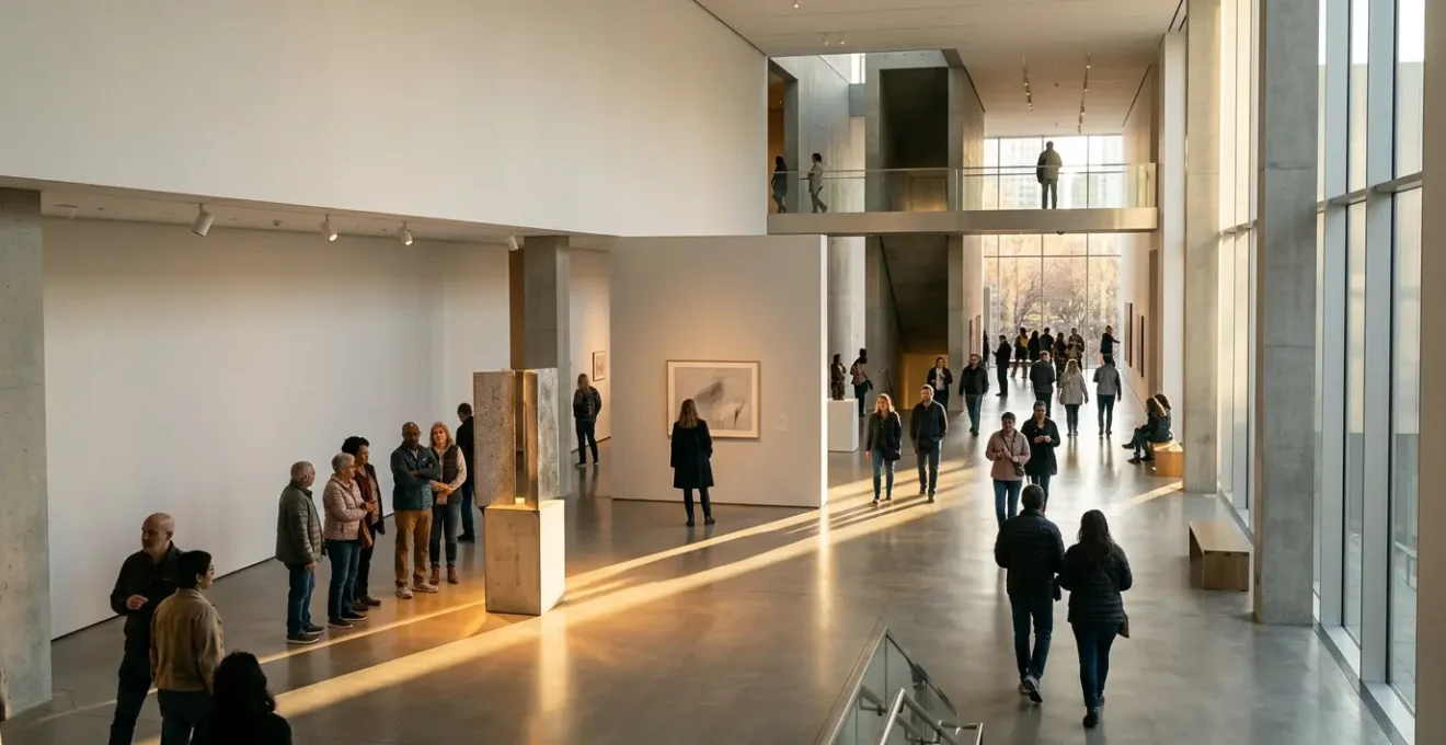
Effective visitor guidance is often invisible. Instead of relying on intrusive signs that add to the cognitive clutter, sophisticated exhibition design uses light to create a ‘visual pull’. This theatrical approach to wayfinding leverages basic human instincts: our eyes are naturally drawn to contrast and brightness. By creating a deliberate hierarchy of light, you can subconsciously direct attention and sculpt a spatial narrative, guiding visitors from one point to the next in a seamless flow.
This technique involves layering different types of light. Ambient light provides a safe, baseline level for navigation. Accent lighting draws attention to specific exhibits, making them stand out. Finally, focal lighting creates dramatic ‘hotspots’ on your star pieces, making them the brightest points in the room. According to theatrical lighting principles, a key exhibit should be 3-5 times brighter than its immediate surroundings to create a powerful, subconscious draw. This hierarchy tells visitors what is important without a single word.
As this visual demonstrates, carefully placed pools of light can form an intuitive pathway. You can also manipulate colour temperature to signal thematic shifts; moving from a neutral white light in one gallery to a warmer tone in the next can subconsciously prepare the visitor for a change in subject or mood. By thinking like a lighting designer, you move from simply illuminating objects to choreographing the visitor’s gaze and pace, creating a more fluid, intuitive, and less stressful journey through the museum.
Families vs Solo Scholars: Who Needs More Seating in Gallery Spaces?
The question isn’t who needs *more* seating, but who needs *different kinds* of seating in different locations. Seating in a museum is not just a functional amenity; it’s a strategic tool for managing dwell time and accommodating diverse visitor behaviours. A one-size-fits-all approach of placing identical benches in every gallery fails to address the specific needs of your audience segments, from the solo scholar poring over details to the family trying to regroup.
The solo scholar or art enthusiast may require a “Perch Point”—a simple lean-to surface or an isolated single seat near a complex exhibit—for a brief, focused pause without fully disengaging. In contrast, a family with young children needs a “Recharge Hub.” This means clustered, durable benches in more central, open areas where they can gather, rest, and plan their next move without feeling like they are obstructing traffic. Placing a single bench in a quiet corner does little for a group of five, while a large seating arrangement in front of a detailed artwork can frustrate individuals trying to get a closer look.
By mapping visitor personas to seating typologies, you can transform passive rest areas into active tools for enhancing the visitor experience. An effective seating strategy provides the right kind of pause, in the right place, for the right duration. As an analysis of museum environments shows, this segmentation is crucial for creating a truly user-centric space.
| Seating Type | Target Audience | Design Features | Placement Zone |
|---|---|---|---|
| Perch Points | Solo Scholars | Lean-against surfaces for brief pauses | Near detailed exhibits |
| Recharge Hubs | Families with Children | Clustered, durable benches for regrouping | Central gallery areas |
| Contemplation Nooks | Art Enthusiasts | Isolated single seats facing artwork | Quiet gallery corners |
| Social Alcoves | Groups/Tours | Benches facing each other | Transition spaces |
The Layout Mistake That Creates Frustrating Queues at Star Exhibits
The single biggest layout mistake is creating a dead end. When a star masterpiece is placed flat against a wall at the end of a linear path, it creates a single point of congestion. Visitors crowd in for a view, blocking those behind them and creating a frustrating bottleneck that kills the flow and emotional momentum of the exhibition. This “cul-de-sac” design forces a chaotic scrum rather than a moment of contemplative awe. It’s a failure of architectural planning that prioritizes the object over the human experience of viewing it.
The solution lies in designing for circular flow and managing expectations. One of the most effective strategies is the “360-Degree Island” layout, where the masterpiece is placed in the center of a large room, allowing visitors to approach and circulate from all sides. This naturally disperses crowds and provides multiple viewing angles. Another powerful architectural concept is “Pressure and Release”: guiding visitors through a narrower, preparatory corridor that then opens up into an expansive viewing space. This transition builds anticipation (pressure) and delivers a dramatic, rewarding reveal (release), while the large space absorbs the crowd.
For extremely popular exhibits, architectural solutions may need to be paired with operational ones. As a case in point, the Museum of Modern Art (MoMA) in New York has implemented a virtual queue system for its blockbuster shows. This allows visitors to reserve a viewing slot digitally, freeing them to explore other galleries instead of waiting in a physical line. This “activating the wait” strategy respects the visitor’s time and transforms a frustrating experience into a positive one.
Action Plan: Auditing Your Star Exhibit’s Visitor Flow
- Points of Contact: Map all visual and physical entry and exit points to the exhibit space. Are they distinct or do they overlap, causing cross-traffic?
- Data Collection: Observe and time visitor paths for 30 minutes during a peak period. Where do bottlenecks form? Note the average viewing time versus waiting time.
- Coherence Check: Does the architectural approach to the exhibit build anticipation and provide preparatory context, or does it create a sudden, frustrating stop?
- Emotional Arc: Survey visitors immediately after. Do they describe their experience with words of awe or frustration? Identify moments of friction versus satisfaction.
- Integration Plan: Based on observations, sketch one key change: widening an entryway, adding a pre-show text panel on an approach wall, or marking designated photo spots to control crowd behaviour.
How to Position the Retail Space to Capture the ‘Exit High’ Without Feeling Predatory?
The shop should capture the ‘peak’ emotional high from the exhibition, but it shouldn’t be the ‘end’. The final experience should be a non-commercial ‘decompression zone’
– Museum Experience Design Principles, Designing for the Museum Visitor Experience
The transition from the exhibition to the retail space is one of the most delicate moments in the visitor journey. The goal is to capture the “exit high”—that peak emotional and intellectual state a visitor is in immediately after a powerful exhibition—without making the commercial intent feel abrupt or predatory. Forcing visitors through the gift shop to reach the exit is a common but aggressive tactic that can sour the entire experience, leaving a final impression of commercialism rather than culture.
The most elegant solution is to create a multi-stage exit sequence. The retail space should be presented as an optional, attractive next step, not a mandatory tollgate. This can be achieved by designing the exit path to run adjacent to the shop entrance, with a clear and visible route to the main exit for those who wish to bypass it. The shop itself should feel like a thematic extension of the exhibition, a place to find curated books and objects that deepen the experience, rather than a generic souvenir store.
Crucially, the journey shouldn’t end with the shop. The final moment before a visitor leaves should be a “decompression zone.” This could be a quiet lounge, a small reflective garden, or a simple hall with comfortable seating. This non-commercial space allows visitors to process their experience, discuss it with companions, and transition back to the outside world at their own pace. By placing this buffer zone after the retail opportunity, you respect the visitor’s emotional state and ensure their lasting memory is of the exhibition’s impact, not the pressure to make a purchase.
Why Are Photos of Mundane High Streets Becoming Valuable Historical Records?
To truly increase dwell time, you must forge a deep emotional connection with your visitors. While blockbuster artifacts create spectacle, it is often the relatable, personal histories that foster the most profound engagement. This is why mundane, everyday imagery—like photographs of local high streets from past decades—is becoming an invaluable curatorial asset. These images tap into a powerful sense of nostalgia and personal identity, transforming passive viewers into active participants in their own history.
For a visitor, seeing a photo of a familiar shop they remember from their childhood, or a street corner where they once met friends, creates an immediate and powerful resonance that a globally significant artifact might not. It anchors the museum’s narrative within their own lived experience. This hyperlocal focus positions the museum not just as a keeper of history, but as a custodian of community memory. This strategy is exceptionally effective for engaging local audiences and encouraging repeat visitation.
Leveraging this connection requires a shift towards co-creation and dynamic content. Museums can empower their communities to become part of the narrative by creating platforms for them to contribute their own stories and images. This can take many forms:
- Interactive Digital Kiosks: Allow visitors to upload their own photos and memories related to the exhibits.
- ‘Disappearing High Street’ Exhibitions: Tap directly into local nostalgia by focusing on the changing face of the community.
- Geotagged Social Media Curation: Use visitor-generated content from platforms like Instagram as a source for new, dynamic exhibits about the local area.
- Visitor Co-Creation Programs: Launch projects that invite the community to actively participate in documenting and preserving local history.
By embracing the mundane, you make the museum’s work deeply personal. You create a space where visitors don’t just see history; they see themselves. This emotional investment is a powerful driver of engagement and, consequently, extended dwell time.
Why Do Visitors with Autism Need to Know Where the Hand Dryers Are?
For many autistic individuals, anxiety stems from the unknown and a lack of control over their environment
– Museum Accessibility Guidelines, Inclusive Museum Design Principles
For a neurotypical visitor, a loud hand dryer is a minor, fleeting annoyance. For an autistic visitor with sensory sensitivities, the sudden, high-decibel roar can be an overwhelming and distressing sensory assault. It can trigger anxiety, a meltdown, and a premature end to their museum visit. The need to know the location of hand dryers is not a trivial preference; it’s a critical piece of information for navigating the environment safely and without distress. It’s about predictability and control.
This highlights a core principle of designing for neurodivergent audiences: the importance of a comprehensive Sensory Map. This goes far beyond a standard floor plan. A sensory map identifies and clearly marks all potential sensory triggers within the museum: areas with loud noises, bright or flashing lights, strong smells, or dense crowds. It also highlights “Quiet Zones” or low-stimulus areas where a visitor can retreat to decompress. By providing this map online before the visit, you empower autistic visitors and their families to pre-plan a “safe” route that avoids their specific triggers, giving them the control and predictability needed to feel secure.
The physical environment itself should also be designed with sensory awareness. This includes practical measures such as:
- Providing a clear choice between high-speed, low-noise hand dryers and paper towels in all restrooms.
- Creating designated “sensory-friendly” restrooms with controlled acoustics and lighting.
- Installing user-controlled volume and brightness settings on all interactive exhibits.
By addressing specific sensory triggers like hand dryers, you are not just making a small accommodation. You are demonstrating a fundamental understanding of sensory accessibility and creating a truly welcoming environment built on predictability and trust.
Key Takeaways
- Visitor fatigue is your primary enemy; combat it with ‘cognitive palate cleansers’ and strategic pacing.
- Use an invisible hand: guide visitors with a hierarchy of light and ‘pressure and release’ architecture instead of cluttered signage.
- Universal design is not a niche concern; designing for sensory accessibility creates a more comfortable and engaging experience for all visitors.
Visiting Museums: Making Exhibitions Accessible for Neurodivergent Audiences?
Making museums accessible for neurodivergent audiences is not a matter of occasional, special-programming. It is a fundamental shift towards Universal Design, where inclusivity is baked into the core of the exhibition from the very beginning. The goal is to create an environment that offers choice, control, and predictability to all users. When you design for the needs of the most sensitive visitors, you invariably create a more comfortable, less stressful, and more engaging experience for everyone. A less crowded, more quietly guided experience benefits the tourist, the scholar, and the family alike.
This approach is also a strategic necessity. In a world of slick digital entertainment, a museum visit must be an exceptionally positive experience to compete. Data suggests that only 30% of visitors remain engaged after a visit, and this is only if their expectations are exceeded. A stressful or overwhelming environment is a surefire way to fail that expectation. Implementing universal design is a powerful way to ensure the experience is positive and memorable.
Practical implementation of Universal Design for neurodiversity involves a multi-layered approach:
- Pre-Visit Information: Offer downloadable ‘Social Stories’—visual, step-by-step guides that explain the entire visit, from buying a ticket to exiting the building.
- Environmental Control: Mark permanent ‘Quiet Zones’ on all museum maps and provide sensory kits with items like noise-cancelling headphones and fidget tools.
- Customizable Itineraries: Create multiple pre-designed ‘Sensory Itineraries’ (e.g., ‘Low-Stimulus Trail’ or ‘High-Engagement Trail’) that visitors can choose based on their preferences.
- Integrated Design: Rather than relying on separate ‘autism-friendly hours’, integrate these features into daily operations so they are available to anyone, anytime.
By adopting a universal design mindset, you move from a reactive model of making special accommodations to a proactive one of creating a fundamentally more human-centered institution. This not only opens your doors to a wider audience but also deepens the quality of engagement for every person who walks through them.
The next logical step is to begin auditing your own spaces not just for their content, but for their sensory and cognitive impact. Start by walking through your current exhibition and identifying points of friction, noise, and cognitive overload. Applying these principles of spatial psychology is the key to transforming your museum into a truly resonant and retentive cultural destination.